Multi-measure charts allow users to show and compare multiple measures within a single plot area. When working with Cartesian and Segment charts it's possible to create multi-measure charts that use the SAME y-axis. This includes standard charts, stacked charts, or multi-measure segment charts.
- Click here for more details on using Value drop zones and multi-measure charts with the primary axis.
How to Build a Stacked Measure Chart
The use of multiple measures through a common primary y-axis can be applied to numerous charts types. The most common example is via the use of stacked column charts.
STEP 1
Start by creating a stacked column chart, with one member hierarchy and one measure.
STEP 2
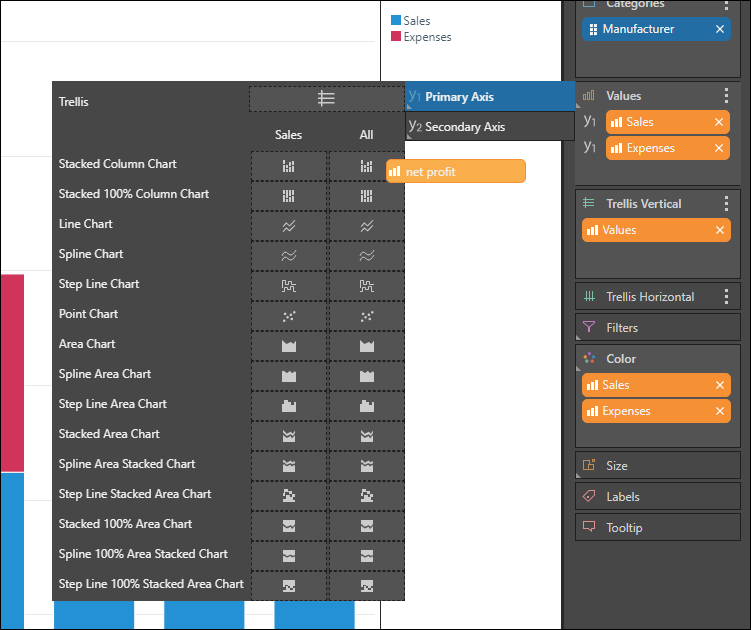
Drag a second measure to the Values drop zone, and add it to the Primary Axis, dropping the chip in either Stacked Column Chart, or Stacked 100% Column Chart.
STEP 3
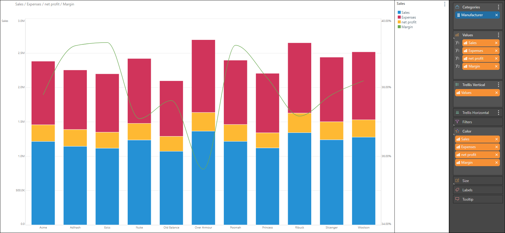
Continue adding the required measures. You can also add a measure to the secondary axis - in the example below, Sales, Expenses, and Net Profit were added to the stacked column chart on the primary axis. Margin, which represents percentages, was added as a spline chart to the secondary axis: